

Master Thesis
The master thesis examines the sometimes bizarre relationship of man to nature and illuminates this from scientific, sociological as well as design perspectives.


Under Pressure
The project Under Pressure is a new, experimental approach to embossing and three-dimensional lettering. Shapes and lines are created by applying and modeling welding wire onto a metal printing plate, which serves as a template for embossing motifs or text into sheet metal. It is a handcrafted process that embraces imperfection, spontaneity, and openness to outcome to generate a distinctive visual language.


Ritterstrasse
Wayfinding system for the industrial complex at Ritterstrasse 12 & 14 in Berlin-Kreuzberg, where gas lamps and taps were manufactured once. In collaboration with Nathanaël Gourdin and Jeldrik Blech at Studio Gourdin.


Solastalgia
A series of therapeutic video sessions that deal with the contradictory relationship we have with nature in these modern times. A mixed media production, created using computer game sequences.

One, Two, Three
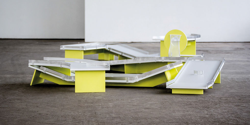
Typographic mini golf courses. Awarded the ico-D Excellence Award, the Joseph Binder Award Gold, and Bronze from the Art Directors Club. In collaboration with Matteo Bauer-Bornemann.


Evergreen
Segment of a one-minute-short selected for The One Minutes, curated by David Blandy.


Stollarchitekten
Visual identity, based on the handwriting of the three managing directors, of an architectural office. Design: Filip Antunović, Font: Gabriel Richter. In collaboration with büro uebele.


Telegraph
Wayfinding system for the office building Telegraph in Berlin. The design is derived from the history of the site, which in the past was the location of a post and telegraph building office. In collaboration with Nathanaël Gourdin and Carolin Tegeler at Studio Gourdin.


Searching for the Perfect Gentleman
An experimental research, after the origin of an african barbershop poster. The video is about trust, perseverance, and a globalized and highly interconnected world we live in. The short film has been screened at numerous film festivals.


Searching for the Perfect Gentleman on youtube.
Segment
Custom font developed for the corporate design of Nathanaël Gourdin, who works at the interface of art and design. In collaboration with Nathanaël Gourdin.


Exhibition Graphics
Printed matter and concept for the presentation of design projects at Dutch Design Week in Eindhoven and for IMM Cologne.


Typotrop
The project deals with the limits of our perception and the legibility of type. The basic idea goes back to the optical illusion of the thaumatrope, based on the inertia of our sense of sight. The result is a typeface divided into two planes, printed on the front and back of plates. The letters only become recognizable to the viewer during the rotation.


